
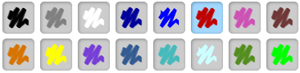
Color Options – Version 3.0.8
Notes Plus has been very limited in pen and text colors. In version 2.0, it had 12 colors; since version 3.0, it has added 4 more. It’s not that I’m “cheap” on colors. I just think that users of a productivity app, Notes Plus, shouldn’t spend too much time choosing a color.
By Chipp Walters using Notes Plus
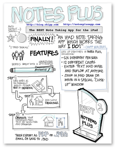
Notes Plus has grown so much in the last 3 years that it is no longer just a note-taking app but also a content-creation app. Look at the beautiful Notes Plus poster created by Chipp Walters using Notes Plus.
Therefore, besides adding various ink effects, version 3.1 also adds an unlimited choice of colors. The challenge is how to present the color-picking UI effectively so that users won’t waste too much time choosing a color.
The old way
I believe the traditional color picker with continuous color gradients (as in Photoshop) must not be used.
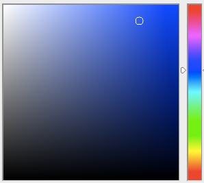
Photoshop Color Picker
Firstly, I believe only artists with an extensive color knowledge can use this effectively. I studied color theory myself and I don’t even know how to use this color picker efficiently.
Secondly, while it might be easy to point the mouse cursor to an exact location, it’s impossible to pick the exact color with touch (on tablets) in this continuous color range.
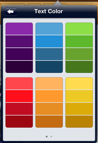
Color Picker of Apple’s Pages iPad App
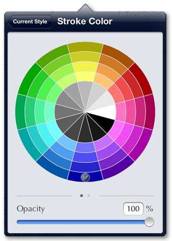
Notes Plus v3.1 Color Picker UI
On the other hand, I adore the simplicity of the color picker in the Apple Pages iPad app with discrete color choices. The only problem is that the color choices are limited and the color arrangement is rather random.
Design objectives
So I am putting down my objectives for this color picker UI. They are rather ambitious but not totally impossible. Here they are in order of importance:
1. Easy to understand. Casual users should be able to start using the color picker without reading any manual. Advanced users can play with the UI a little bit to discover an efficient way to use the color picker but there is no manual needed.
2. Easy to operate. Users should be able to pick a color with a touch of their finger without any problems.
3. Quick to operate. Users should be able to use only one tap to choose a simple color or a frequently-used color.
4. Easy to select a good combination of colors.
5. Unlimited color choices for advanced users.
The Color Wheel
Objectives #3 and #4 greatly conflict with each other. I thought about using color palettes (COLOURlovers.com). However, I have finally chosen to implement a color wheel instead because objective #3 (quick to operate) is more important than #4 (easy to select a good combination of colors). Although not as great as color palettes, a color wheel offers some suggestions to color choices (e.g. complementary colors are opposite each other on the wheel).
Although presented in a circular wheel, color choices are just discrete buttons that users can just tap to select. There is even a hint that the color segments are selectable with a checkmark on the currently selected color. The UI is very easy to understand; thus, objective #1 is satisfied.
How about objective #2? Is it easy to operate? The outer radius of the color wheel is 155 points; the inner radius (gray circle) is 70 points. Touch areas range from 897 to 1607 square points for color segments, 1283 square points for gray segments. These areas are much smaller than that of the minimum comfortable tappable UI component – 44 x 44 points (1936 square points) – as specified in the Apple’s iOS Human Interface Design Guidelines. We do have a problem. I do, however, have a solution and I want to keep mum until version 3.1 has been released. Let it be a surprise.
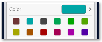
Most-frequently-used-colors quick pick
I’ve had to squeeze all the color choices into one page (no scrolling) to conform to objective #3: quick to operate. In Apple Pages app, if you want to choose a black or gray color, you have to scroll to the next page of their color picker. With Notes Plus version 3.1, it requires one tap only.
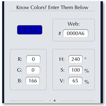
Notes Plus v3.1 – Enter Color Code
When a color is used frequently, it will appear as a tappable icon so that users don’t even have to go into color options.
Finally, objective #5, unlimited color choices for advanced users, is satisfied with an interface to enter color codes.
Why is a series of my blog posts explaining why Notes Plus has become the way it is.
Viet Tran
Saturday, April 27, 2013